Hospital at Home with UChicago Med
Aug 202 - Dec 2022
Our Fall 2022 Communication Design Workshop utilized previously generated research and service blueprint for the Hospital at Home program to develop a communication plan, generate multiple communication vehicle concepts, and prototype select pieces for evaluation and subsequent refinement or implementation.
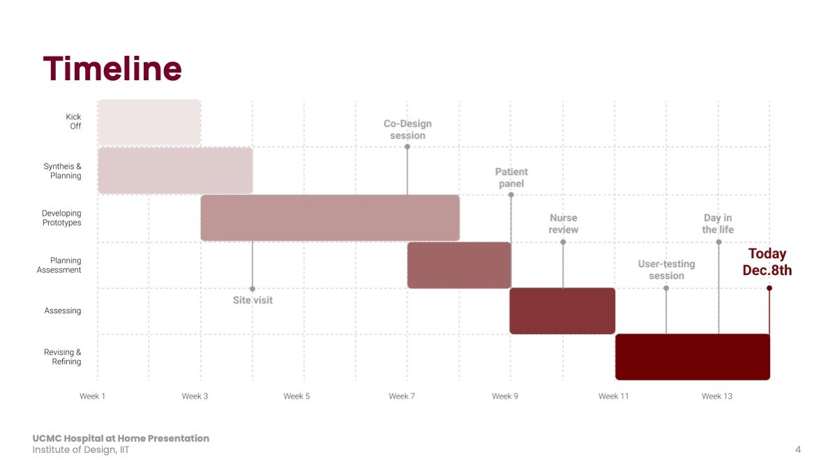
The project is a collaboration with the University of Chicago Medicine. We’ve conducted a site visit and facilitated several research points like the: co-design session, patient panels, and user testing feedback. Each round of feedback and testing provided opportunities for us to align our content with patient knowledge and expectations. The final prototypes span four critical points in the patient journey through the program: recruitment & enrollment, transition to home, ongoing patient care, and discharge from the program. Our EOYS submission includes prototypes from the first phase, where patients and caregivers are recruited, consented to, and enrolled in the program.
Team
Diana Ngyugen, Jie An, Mayukhi Chacham, Smrti Ganesan
Role
Design, Copywriting
How might we communicate the right information regarding the Hospital at Home program to patients and caregivers at the right time?
Developing Patient Materials
Going to the hospital is stressful
Being mindful of patient and caregiver needs at this point in the service. Both stakeholders require high-level, directed information enough to address concerns during the pre-consent stage. The information given should be reassuring and considerate of their previous situations.
We need to align on the framing of different services of the program (e.g. Hospital at Home health monitoring kit) and situations in which these terms are used.

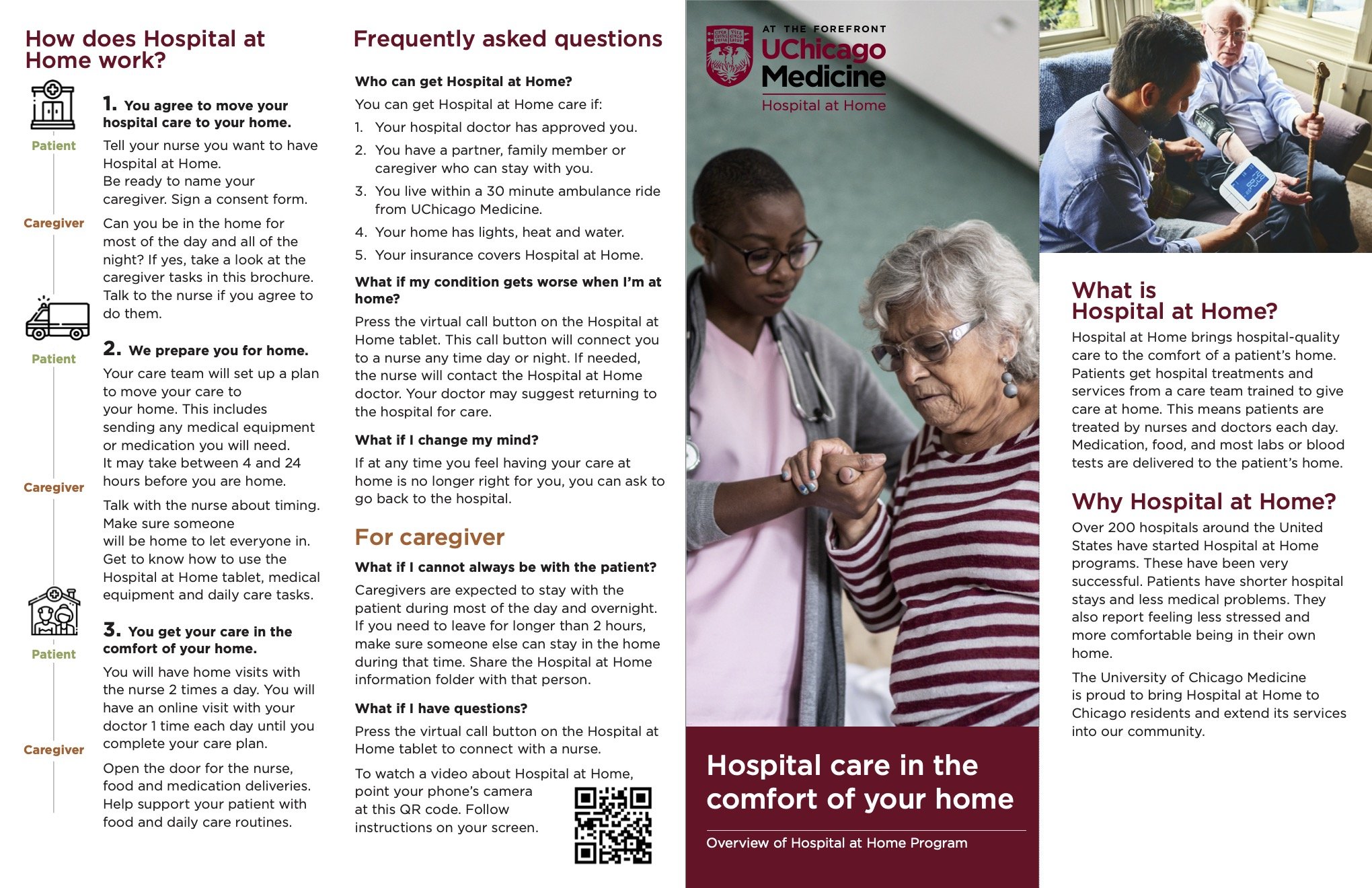
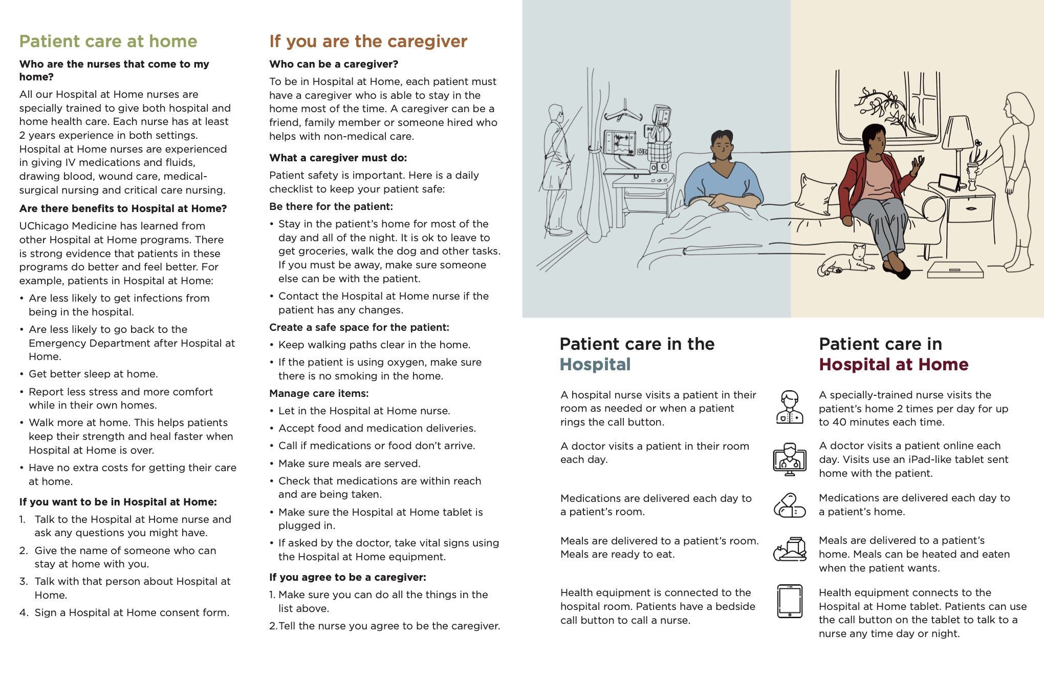
Once medical eligibility is confirmed and pre-consent, the pamphlet is used by nurses as a tool to convey details of the program to patients and caregivers.
Design Considerations
Prioritize necessary information to share with patients and caregivers before decision-making process
Align information shared with patients and caregivers to reduce gaps in understanding
Comfort and empathize with patients at this particular point in their care
Provide an educational tool for nurses, patients and caregivers
Designing for Healthcare
As designers working in the health sector, we had to be meticulous with every choice we made.
Throughout the design process, we had to be conscious of who we were designing for. Not all patients might be fluent in English, or possess the same degree of education.
Language
Language used (2-syllable, short words)
Reading level (5/6th grade, Flesch-Kincaid)
Word spacing & Word count
Content
Legal requirements
Easy to understand
Shifting content and responding to feedback/program development
Readability: font size, font type, font family
Imagery
Use of color
Diversity of subjects in images
Types of imagery: photos, icons, symbols, illustrations
Readability of images


